
This is a small project I did when I was in college, the use of open data to create effective air pollution awareness among the community using JQuery. View how the air quality is changing, health effect it offers using chart visualization provided by CanvasJS, save the visualization in image or PDF document.
Air pollution?
Emissions is the term used to describe the gases and particles which are suspended or emitted in the air through various sources which results in formation of toxics substances which includes carbon monoxide, nitrous oxides, methane, chlorofluorocarbons gases often harmful to human health when consumed indirectly at Hazardous levels - detrimental to human health and the planet, major factor for Climate Change.
How it works?
- Fetch open-source data available at EPA
- Render in charts using CanvasJS
- Display health messages based on current air
- Visualize AQI, PM2.5 using AQI color code
Atmospheric particulates data available
Requirements
How it works?
Lets first create a simple CanvasJS, enable some of the useful features like animation, theme, interactive, tooltip, subtitles inside chart_data
let chart_data = {
    animationEnabled: true,
    exportEnabled: true,
    exportFileName: "Phora Durbar Live AQI",
    animationDuration: 1400,
    zoomEnabled: true,
    zoomType: "xy",
    theme: "light1",
    interactivityEnabled: true,

    toolTip: {
        content: "Date: {label}<br/>Data: {y}"
    },

    axisY: {
        title: "AQI",
        valueFormatString: "#",
    },
    title: {
        text: "AQI",
    },

    subtitles: [{
        text: "Phora Durbar, Kathmandu"
    }],

}
Next, we’ll define empty Array dataPoints in chart_data
data: [{
     dataPoints: []
}]
We are creating a visualization for realtime emission - EPA has physical stations in the various cities to measure air pollution levels and also keep record for historical data. We’ll simply use the data available globally, collect the RSS feed available for your city and add URL to object. window.onload function is used to render the data first whenever CanvasJS is loaded.
let phora_pm2 = 'https://dosairnowdata.org/dos/RSS/PhoraDurbarKathmandu/PhoraDurbarKathmandu-PM2.5.xml';

window.onload = function () {
    chartRenderer(phora_pm2,
        chart_data, 'column', 'AQI')
}
We also need an AQI references where people would be able to distinguish the air pollution levels. It is divided into different color ranges and health messages.
Function aqiColor returns color code where AQI is input, add healthMessage to generate health message for AQI value y. The value range, color code and health message all can be found in the AQI Basics doc.
Note: You can change the chart type column to supported Charts by modifying chart_data when window.onload is initiated.
function aqiColor(y) {
    if (y <= 0) {
        return "#fff"
    } else if (y >= 0 && y <= 50) {
        return "#34e400"
    } else if (y >= 51 && y <= 100) {
        return "#fcff00"
    } else if (y >= 101 && y <= 150) {
        return "#f77e01"
    } else if (y >= 151 && y <= 200) {
        return "#f61802"
    } else if (y >= 201 && y <= 300) {
        return "#8f3f97"
    } else if (y >= 301) {
        return "#7e0623"
    }
}
function healthMessage(y) {
if (y <= 0) {
return "<div class='text-uppercase'>Error!</div><br/>No data was received from the station";
} else if (y >= 0 && y <= 50) {
return "<div class='text-uppercase'>Good</div><br/>The AQI value is between 0 and 50. Air quality is satisfactory and poses little or no health risk.";
} else if (y >= 51 && y <= 100) {
return "<div class='text-uppercase'>Moderate</div><br/>The AQI is between 51 and 100. Air quality is acceptable; however, pollution in this range may pose a moderate health concern for a very small number of individuals. People who are unusually sensitive to ozone or particle pollution may experience respiratory symptoms.";
} else if (y >= 101 && y <= 150) {
return "<div class='text-uppercase'>Unhealthy for Sensitive Groups</div><br/>When AQI values are between 101 and 150, members of sensitive groups may experience health effects, but the general public is unlikely to be affected.<br><b>Ozone:</b> People with lung disease, children, older adults, and people who are active outdoors are considered sensitive and therefore at greater risk.<br><b>Particle pollution:</b> People with heart or lung disease, older adults, and children are considered sensitive and therefore at greater risk.";
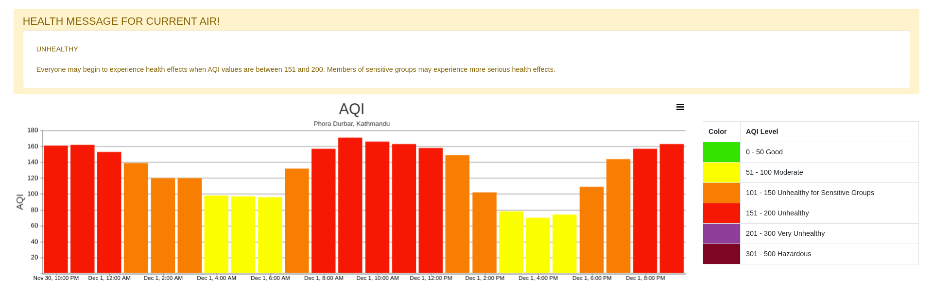
} else if (y >= 151 && y <= 200) {
return "<div class='text-uppercase'>Unhealthy</div><br/>Everyone may begin to experience health effects when AQI values are between 151 and 200. Members of sensitive groups may experience more serious health effects.";
} else if (y >= 201 && y <= 300) {
return "<div class='text-uppercase'>Very Unhealthy</div><br/>AQI values between 201 and 300 trigger a health alert, meaning everyone may experience more serious health effects.";
} else if (y >= 301) {
return "<div class='text-uppercase'>Hazardous</div><br/><b>Health alert:</b> AQI values over 300 trigger health warnings of emergency conditions. The entire population is even more likely to be affected by serious health effects."
}
}
Finally, add function chartRenderer and include empty Arrays for dataPoints lables_. We use JQuery to fetch XML data using chartRenderer function.
function chartRenderer(url, chartData, chartType, airDataType) {
    let chart = new CanvasJS.Chart("chartContainer", chartData)
    let dataPoints = []
    let labels_ = []

    $.get(url, function (data) {
        $(data).find("item").each(function () {
            let $dataPoint = jQuery(this);

            let label = new Date($dataPoint.find("ReadingDateTime").text()).toLocaleString('en-US', {
                month: 'short',
                day: 'numeric',
                hour: 'numeric',
                hour12: true,
                minute: 'numeric'
            });
            let y = $dataPoint.find(airDataType).text();
            dataPoints.push({label: label, y: parseFloat(y), color: aqiColor(parseInt(y))});
            labels_.push(label)

        });
        chartData.data[0].type = chartType
        chartData.data[0].dataPoints = dataPoints

        let health_aqi = dataPoints.slice(-1)
        let z = parseInt(health_aqi[0].y)

        let message = healthMessage(z)

        document.getElementById("health_message").innerHTML = message

        chart.render()
    });
If you refer to XML structure, we are interested in XML item element where reading date, AQI and description are found. In dataPoints, label represents the time sequence in Month-Day-Time in 24hr format, y is AQI value in float data type, aqiColor fetch color code for every AQI, each feed from station may consists of 24 hours of data and interval of 1 hour update time. Later, the slicing is done to get the latest feed and generate health messages. Use chart.render() to visualize the chart. And don’t forget to add document.getElementById() method for health_message to render in HTML document.
Xml tree structure
.
├── rss
    └── channel
        └── title
             └── item
                 └── title
                 └── description
                 └── param
                 └── conc
                 └── nowcastconc
                 └── aqi
                 └── desc
                 └── readingdatetime
Render Chart in HTML
Import JQuery, CanvasJS, visualization_document.js in HTML head tag. CanvasJS only render a chart if you include id, height, and width. Likewise, we will use the append health messages.
To render CanvasJS;
<div id="chartContainer" style="height: 420px; width: 100%;"></div>
To render health message;
<div id="health_message" class="card text-justify" style="padding: 30px;">Updating...</div>
We have successfully created a visualization graph with a health message for any latest AQI data. We are also adding a simple HTML table as a reference to the AQI color range and code to understand air quality better.
<table>
    <thead>
        <tr>
            <th>Color</th>
            <th>AQI Level</th>
        </tr>
    </thead>
    <tbody>
        <tr>
            <td style="background: #34e400;"></td>
            <td>0 - 50 Good</td>
        </tr>
        <tr>
            <td style="background: #fcff00;"></td>
            <td>51 - 100 Moderate</td>
        </tr>
        <tr>
            <td style="background: #f77e01;"></td>
            <td>101 - 150 Unhealthy for Sensitive Groups</td>
        </tr>
        <tr>
            <td style="background: #f61802;"></td>
            <td>151 - 200 Unhealthy</td>
        </tr>
        <tr>
            <td style="background: #8f3f97;"></td>
            <td>201 - 300 Very Unhealthy</td>
        </tr>
        <tr>
            <td style="background: #7e0623;"></td>
            <td>301 - 500 Hazardous</td>
        </tr>
    </tbody>
</table>
At last
The final visualization;
You can find the source code here or view live demo.
If you got stuck somewhere, find project file structure tree below;
air_pollution
 |
 +-- index.html
 |
 +-- js
 |  |
 |  \-- canvasjs.min.js
 |  \-- live_visualize.js
 |  \-- jquery.min.js.js
Leave a comment